


.svg)

Project overview
Warehouse and logistics operations have never been easy to manage or optimize. Inventory accuracy, space utilization, picking accuracy, and order fulfillment speed — all of these challenges are impossible to overcome without the right software.
The cacophony of data from warehouse management systems (WMS) and real-time camera footage holds the key to overcoming these and other challenges. Yet, no solution could bridge the gap between the two and align the insights with Standard Operating Procedures (SOPs).
That is, until our client set out to build one.
The conceived platform would use AI vision to extract information from real-time feeds and combine it with data from WMSs. The goal? Provide 3PL providers, distribution centers, manufacturers, and retailers with a 360-degree operational view of warehouse operations.
Like any other warehouse solution, the sheer amount of data and range of capabilities posed a key product design challenge. Failing to make insights easy to grasp and workflows intuitive, and user adoption will suffer, threatening long-term revenue as a result.
So, our client decided to approach product design with caution, starting with a comprehensive design concept. That’s why Darly Solutions was brought on board.
Client’s Review
Services

.png)
Challenges
With the development expected to be long and costly, the startup couldn’t risk relying on faulty assumptions about users or tanking adoption numbers with poorly thought-out user flows. That’s why we were tasked with creating a comprehensive design concept — a blueprint for the platform’s UI/UX design.
The expected software complexity and versatility would be a key challenge for designers and developers alike. So, we had to ensure every workflow was convenient and met user needs, without causing cognitive overload. All insights had to be presented in an intuitive, easy-to-grasp way, as well.
Following the initial project discussions, we outlined the key needs and requirements that guided our efforts. They included:
Strategic business needs
01 Flesh out the definition of the target audience, problem, and pain points
02 Reduce design cycle time with a comprehensive design concept
03 Mitigate the risk of setbacks due to poor UX based on incorrect assumptions
04 Improve resource utilization during development with detailed guidelines
Technical requirements
01 Clearly define the problem that the product will be solving
02 Research target users and define key pain points
03 Analyze the market and competition to identify key product advantages
04 Prepare a design concept statement
05 Outline the product’s structure and key features
06 Define core design parameters (e.g., typography, color scheme, etc.)
07 Accompany design guidelines with low-fidelity sketches
08 Prepare and hand over comprehensive documentation for the client’s team
Can’t risk relying on wrong assumptions in design and development?
We’ll use extensive research to verify assumptions, help you allocate resources more efficiently, and improve the product’s adoption and engagement.

.avif) Talk to an expert
Talk to an expert.webp)
Solutions
To gain a holistic understanding of the product’s purpose, goals, and value, we conducted research. Our team dug deep into the target audience, market, and competitors to define user personas and align the design concept to their needs and expectations.
At the same time, we worked closely with the client to understand the team’s product vision and underlying business goals. Thanks to holding our workshop early on, we could prevent foundational misunderstandings and make sure everyone was on the same page from the very start.
Armed with our research and the client’s input, we moved on to ideation and sketching to create the design concept. It included:
- Design concept statement
- Product structure
- User personas
- Design guidelines
- Low-fidelity sketches
Based on the client’s feedback and our own A/B testing, we iterated on our deliverables until they were ready to guide further development.
.png)
.png)
.png)
Design concept statement
Using our research and analysis as the foundation, we formulated the platform’s vision. It set the direction for our further conceptual work, as well as our client’s design and development efforts in the long run.
We positioned the product as an innovative AI-driven platform that closes the SOP execution gap with real-time alerts and an end-to-end virtual overview of operational processes. Its target audience would comprise 3PL providers, distribution centers, retailers, and manufacturers.
This clear, precise design concept statement helped ensure design consistency and facilitate cross-team collaboration later on.
.png)
Value-focused product structure
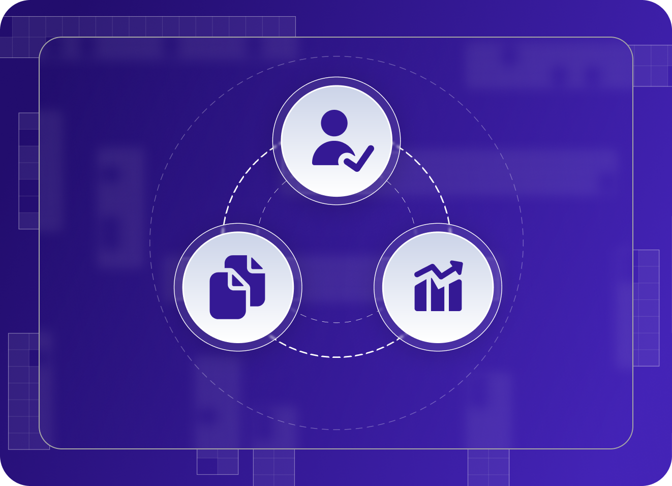
As is often the case, our client initially struggled to define which features were absolute musts for the product and which could be introduced post-launch. Our insights into the target audience helped make this decision and outline the product’s future core components. Those included:
- Real-time monitoring
- AI vision for CCTV footage
- Performance analytics and operational insights
- Order tracking
- Loss prevention
- Dispute resolution
- Compliance monitoring
Understanding which features would add the highest value to the platform early on was a boon for our client. After all, it enabled the startup to dedicate its limited resources to the features poised to deliver the highest ROI.
.png)
Easy-to-grasp insights
Data visualization was going to be paramount for the product’s success, as it became clear early on. After all, the product’s whole purpose was to provide real-time visibility into every facet of warehouse operations, from order-specific data to inventory management.
So, we paid particular attention to the many ways the product could present performance analytics and operational insights. Based on user research and testing, we identified the most appropriate visualization types for each indicator (e.g., bar charts, line charts, pie charts). We also mapped out easy-to-scan-through layouts for critical screens.
Thanks to our focus on simplifying complex data, the platform's analytics features showed the highest engagement rates among early adopters in internal testing, outpacing the second most-used feature, order tracking, by 13 percentage points.
.png)
Complex workflows made simple
Change resistance was a common refrain among warehouse operators who struggled to implement a new software solution. Simply put, end users were usually set in their ways, even when their habits made processes less efficient.
On the other hand, a platform as innovative as our client’s would come with a learning curve. It was our job to make it as gentle as possible.
To that end, we devised a series of guidelines for designing the platform’s user flows. Those included accounting for diverse user paths, minimizing the number of required actions, and using clear labels and instructions. These guidelines helped reduce time on task by 17% compared to industry benchmarks and secure a 92% task success rate across the product.
.png)
Customizable views and workflows
As our research revealed, potential buyers would pay close attention to the platform's flexibility and customizability when evaluating its fit. So, we defined these two characteristics as key differentiators for the product.
Thanks to our precise guidelines and examples, the client’s team could easily make every workflow highly adaptable, be it the individual order view or the dispute resolution process.
The platform’s customizability and flexibility won over early adopters. In fact, they were among the most frequently cited advantages of using the platform.
Comprehensive documentation
Our design concept was meant to inform every design and development choice our client makes in the long run. So, the documentation we provided had to be detailed and comprehensive to ensure UI/UX consistency down the road.
As per usual, we approached preparing documentation like we’d approach creating a blueprint for the platform. Of course, the documentation went beyond presenting the design concept statement and user personas. It also provided clear guidelines for crafting the platform’s look and feel, from its structure and screen layouts to typography and color scheme.
Having this kind of design bible helped our client speed up design cycles by 22%, as per the team’s feedback.

.png)
Tech stack
Impact
Thanks to a unified design concept, everyone on the client’s team could easily ensure the platform’s look and feel remained consistent — and put its value front and center. Most of its impact was qualitative, including:
- Easier cross-team collaboration
- Better product-market fit
- Reduced risk of costly UI/UX reworks later on
- Improved alignment with user needs and expectations
- Clear, consistent product vision
- Informed decision-making during design and development
- More efficient resource planning and utilization
However, our client also noticed several quantifiable results stemming from our involvement:
Complex workflows risk undermining the value proposition?
We’ll help you make the complex simple with clear guidelines for a thoughtful, user-centered UI/UX design.
Contact usTestimonials

I love it! The team was thinking about the logic of the app first, instead of just making a code. They supported my vision.

I love it! The team was thinking about the logic of the app first, instead of just making a code. They supported my vision.
Anna Vashchuk
Startup Founder
Darly made me an app owner! The price we agreed is what I paid. I've already decided to work with them on my next project.
Darly made me an app owner! The price we agreed is what I paid. I've already decided to work with them on my next project.
Oliwia Kowalska
App Owner
We’ve been working together for over 2 years. Since then, our webpage has been ranking high on Google and bringing us leads.
We’ve been working together for over 2 years. Since then, our webpage has been ranking high on Google and bringing us leads.
Anastasiya Shitikova
Head of Marketing
We got the website ready and out of the gate in record time! Darly helps us maintain and refine the website for SEO purposes.
We got the website ready and out of the gate in record time! Darly helps us maintain and refine the website for SEO purposes.
Kavya Khattar
Product Owner
The responsiveness, attention to detail and high-level communication from Darly Solutions was outstanding. Communication with the team was all online and was absolutely seamless. They were highly responsive, worked to tight deadlines and provided great feedback and communication throughout the entire project to ensure it remained on schedule and all quality requirements were being met. They exceeded all of our expectations, from design through to delivery.

The responsiveness, attention to detail and high-level communication from Darly Solutions was outstanding. Communication with the team was all online and was absolutely seamless. They were highly responsive, worked to tight deadlines and provided great feedback and communication throughout the entire project to ensure it remained on schedule and all quality requirements were being met. They exceeded all of our expectations, from design through to delivery.
Kieran Donovan
Managing Director, Corporate Advisory Firm
LLC Darly Solutions's team performs well since the collaboration started. They are fluent in specific programming languages, they are also fluent in English, and they have a great response time. What is most unique and impressive about Darly Solutions is that everyone in the team is inherently communicative and understands the expertise of their respective fields. The team is very agile and can predict stress situations in which we work together to fix and maintain.

LLC Darly Solutions's team performs well since the collaboration started. They are fluent in specific programming languages, they are also fluent in English, and they have a great response time. What is most unique and impressive about Darly Solutions is that everyone in the team is inherently communicative and understands the expertise of their respective fields. The team is very agile and can predict stress situations in which we work together to fix and maintain.
Carol Arao
Product Owner, Software Development Company
Darly Solutions' work so far inspires confidence, as they're skilled and trustworthy. The health platform is incredibly happy with their work. The team at Darly is communicative, responsive, and responsible. I’d recommend them to people looking to do more than build a simple little software.

Darly Solutions' work so far inspires confidence, as they're skilled and trustworthy. The health platform is incredibly happy with their work. The team at Darly is communicative, responsive, and responsible. I’d recommend them to people looking to do more than build a simple little software.
Jürgen Bröker
Executive Director, Healthcare Platform Co.
By collaborating with Darly Solutions, there is a significant improvement in the project's quality of codes compared to their original codebase. They lead efficient project management and keep the client updated with their reports. They're a flexible team that delivers promising results. They don't just do as they're told, they actively participate in the design process, which is going to yield us a much better platform in the end.

By collaborating with Darly Solutions, there is a significant improvement in the project's quality of codes compared to their original codebase. They lead efficient project management and keep the client updated with their reports. They're a flexible team that delivers promising results. They don't just do as they're told, they actively participate in the design process, which is going to yield us a much better platform in the end.
PJ Fisher
Head of Tech, Software Consulting Firm
Darly Solutions was able to develop the site with all functions running. The team was responsive throughout the engagement. They excelled at scheduling and delivered projects on the specified timeline. The whole team was a pleasure to work with. I am very glad that I entrusted them with my project, this is the best company for me!

Darly Solutions was able to develop the site with all functions running. The team was responsive throughout the engagement. They excelled at scheduling and delivered projects on the specified timeline. The whole team was a pleasure to work with. I am very glad that I entrusted them with my project, this is the best company for me!
Inna Netudikhata
CEO, Mama Travel
The quality of their work is very high, and we get very good customer feedback on what our site looks like. They're very reliable and have a great overview of the technologies they're using. They meet our deadlines and are very accurate with their time estimations on a project. In addition, they're responsive and great with communication with a great command of English — it's very easy to talk to them. Moreover, we've integrated them into our development and scrum process, where we have daily stand-ups with their project manager and developers through Slack.

The quality of their work is very high, and we get very good customer feedback on what our site looks like. They're very reliable and have a great overview of the technologies they're using. They meet our deadlines and are very accurate with their time estimations on a project. In addition, they're responsive and great with communication with a great command of English — it's very easy to talk to them. Moreover, we've integrated them into our development and scrum process, where we have daily stand-ups with their project manager and developers through Slack.
Felix Leontyev
Head of Technology, PSS AG
LLC Darly Solutions are highly skilled at UI/UX and follow very good engineering standards, and have been very professional in its approach to all the work to date (including the initial consultancy, which was the deciding factor). They have taken ownership of the work in way that demonstrates how much they value the work they are doing and consequently the work we are doing. I am gaining confidence that the decisions they make are good decisions and that this will result in a product that will exceed our initial expectations.

LLC Darly Solutions are highly skilled at UI/UX and follow very good engineering standards, and have been very professional in its approach to all the work to date (including the initial consultancy, which was the deciding factor). They have taken ownership of the work in way that demonstrates how much they value the work they are doing and consequently the work we are doing. I am gaining confidence that the decisions they make are good decisions and that this will result in a product that will exceed our initial expectations.
Gordon Lang
CTO, Vidina Solutions Ltd
Darly Solutions developed the app in a quick manner, and the code quality was excellent. The professional team was committed to building a successful product. The code quality was good, and the app has been built in a little more than 1 month, which is a result I'm very happy with. They were laid back but professional at the same time.

Darly Solutions developed the app in a quick manner, and the code quality was excellent. The professional team was committed to building a successful product. The code quality was good, and the app has been built in a little more than 1 month, which is a result I'm very happy with. They were laid back but professional at the same time.
Piotr Nowakowski
Founder, 79 Characters, Inc.
Darly Solutions’ work helped my business tremendously. They were able to identify key areas for growth and improvement. The team was communicative and professional throughout the entire engagement. LLC Darly Solutions is a solutions-oriented vendor that drives results. They’re really professional and they know what they’re doing. The team knows how to identify my problems and solve them.

Darly Solutions’ work helped my business tremendously. They were able to identify key areas for growth and improvement. The team was communicative and professional throughout the entire engagement. LLC Darly Solutions is a solutions-oriented vendor that drives results. They’re really professional and they know what they’re doing. The team knows how to identify my problems and solve them.
Maiza Simeon
Founder, Food App Startup
Related case study

Connect with us
.webp)
We are a tech partner that delivers ingenious digital solutions, engineering and vertical services for industry leaders powered by vetted talents.